Home Project Resources Data Sources GitHub Repository

HEATING FIRE INCIDENTS
IN NEW YORK CITY

by Merissa Lissade

Back to Home

(all visualizations are interactive and best viewed on a desktop)


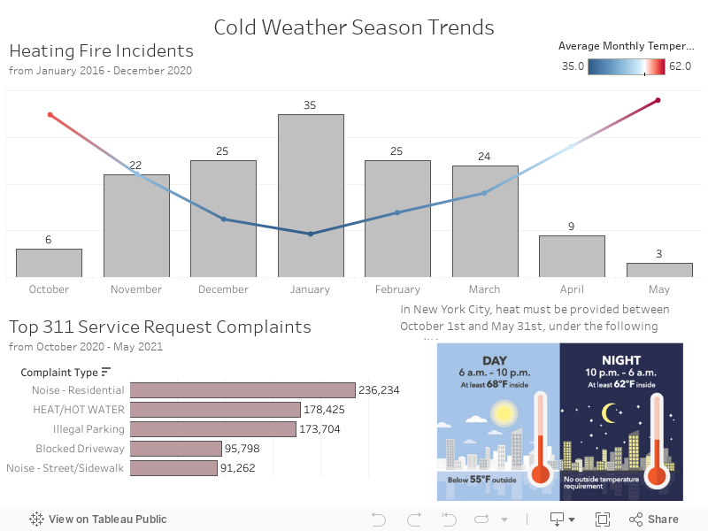
In New York City, there are heat regulations that state heat must be provided between October 1st and May 31st. During the day, from 6 AM to 10 PM, if the outside temperature falls below 55 degrees then the inside temperature is required to be at least 68 degrees Fahrenheit. At night, from 10 PM to 6 AM, the inside temperature is required to be at least 62 degrees Fahrenheit regardless of the outside temperature.

In the visualization above, the line represents the average monthly temperature with 55 degrees as the midpoint, meaning all temperatures that fall below the 55 degree threshold are colored blue. We can see that the month of January is both the coldest month of the season as well as the month that had the most fire incidents between the years of 2016 to 2020. We can also see that in the cold weather season of 2020 to 2021, "HEAT / HOT WATER" was the second highest service request complaint made to 311.

These maps show the areas in which complaints were made and violations were found. The map on the left shows us how many complaints NYC residents make with the 311 hotline. When 311 receives these complaints, they direct them the HPD - the department of Housing Preservation and Development. HPD then investigates the complaints by trying to reach out to the building owner or management to see if heat has been restored. If the problem is not resolved, HPD sends out an inspector who verifies the copmlaint and issue the appropriate violation.
On the right, we can see all the issued violations. After a violation is issued, HPD usually starts a court proceeding. The agency can seek penalties up to $1000 per day until to violation is corrected.
We notice that the same areas with the most complaints are the same areas with the most violations. These areas that have the most copmlaints and violations are also associated with the lower income areas of the city.

The bubbles in the chart above represent community districts within each borough. The size of each bubble represents the number of heating fire incidents that happened in that district from 2016 to 2020. Below the bubble graph we see an area chart that shows us the number of heating fire incidents over the years. The bar graph shows how many fatalities caused by the heating fire incidents in each borough.

In this chart, each circle represents a home fire incident fatality. Although many remain under investigation, of the causes that are known, heating is the number one cause.

Visuals created with Tableau